Overview
Why is it important? Many people say machine learning models are "black boxes", in the sense that they can make good predictions but you can't understand the logic behind those predictions. This statement is true in the sense that most data scientists don't know how to extract insights from models yet. However, this blog will touch upon techniques to extract the following insights from sophisticated machine learning models.
- What features in the data did the model think are most important?
- For any single prediction from a model, how did each feature in the data affect that particular prediction?
- How does each feature affect the model's predictions in a big-picture sense (what is its typical effect when considered over a large number of possible predictions)?
These insights have many uses, including
- Debugging
- Informing feature engineering
- Directing future data collection
- Informing human decision-making
- Building Trust
Debugging: The world has a lot of unreliable, disorganized and generally dirty data. You add a potential source of errors as you write preprocessing code. Add in the potential for target leakage, and it is the norm rather than the exception to have errors at some point in a real data science project.
Informing Feature Engineering: Feature engineering is usually the most effective way to improve model accuracy. Feature engineering usually involves repeatedly creating new features using transformations of your raw data or features you have previously created. Sometimes you can go through this process using nothing but intuition about the underlying topic. But you'll need more direction when you have 100s of raw features or when you lack background knowledge about the topic you are working on.
Directing Future Data Collection: You have no control over datasets you download online. But many businesses and organizations using data science have opportunities to expand what types of data they collect. Collecting new types of data can be expensive or inconvenient, so they only want to do this if they know it will be worthwhile. Model-based insights give you a good understanding of the value of features you currently have, which will help you reason about what new values may be most helpful.
Informing Human Decision-Making: Some decisions are made automatically by models. Amazon doesn't have humans (or elves) scurry to decide what to show you whenever you go to their website. But many important decisions are made by humans. For these decisions, insights can be more valuable than predictions.
Building Trust: Many people won't assume they can trust your model for important decisions without verifying some basic facts. This is a smart precaution given the frequency of data errors. In practice, showing insights that fit their general understanding of the problem will help build trust, even among people with little deep knowledge of data science.
Permutation Importance
One of the most basic questions we might ask of a model is: What features have the biggest impact on predictions? This concept is called feature importance. There are multiple ways to measure feature importance. Some approaches answer subtly different versions of the question above. Other approaches have documented shortcomings.
Permutation importance: Compared to most other approaches, permutation importance is:
- fast to calculate,
- widely used and understood, and
- consistent with properties we would want a feature importance measure to have.
Permutation importance uses models differently than anything you've seen so far, and many people find it confusing at first. So we'll start with an example to make it more concrete.
Consider data with the following format:
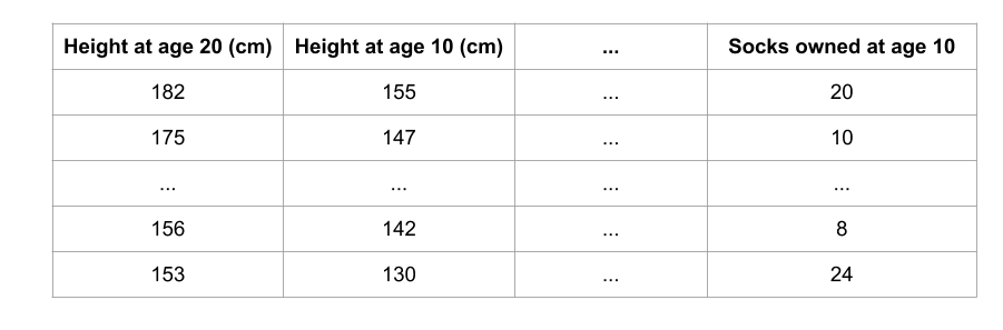
We want to predict a person's height when they become 20 years old, using data that is available at age 10. Our data includes useful features (height at age 10), features with little predictive power (socks owned), as well as some other features we won't focus on in this explanation. Permutation importance is calculated after a model has been fitted. So we won't change the model or change what predictions we'd get for a given value of height, sock-count, etc. Instead we will ask the following question: If I randomly shuffle a single column of the validation data, leaving the target and all other columns in place, how would that affect the accuracy of predictions in that now-shuffled data?
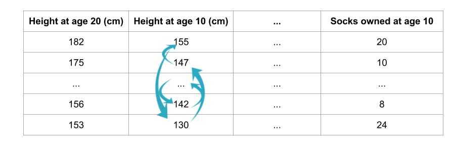
Randomly re-ordering a single column should cause less accurate predictions, since the resulting data no longer corresponds to anything observed in the real world. Model accuracy especially suffers if we shuffle a column that the model relied on heavily for predictions. In this case, shuffling height at age 10 would cause terrible predictions. If we shuffled socks owned instead, the resulting predictions wouldn't suffer nearly as much.
With this insight, the process is as follows:
- Get a trained model.
- Shuffle the values in a single column, make predictions using the resulting dataset. Use these predictions and the true target values to calculate how much the loss function suffered from shuffling. That performance deterioration measures the importance of the variable you just shuffled.
- Return the data to the original order (undoing the shuffle from step 2). Now repeat step 2 with the next column in the dataset, until you have calculated the importance of each column.
Code Example: Our example will use a model that predicts whether a soccer/football team will have the "Man of the Game" winner based on the team's statistics. The "Man of the Game" award is given to the best player in the game. Model-building isn't our current focus, so the cell below loads the data and builds a rudimentary model.
import numpy as np
import pandas as pd
from sklearn.model_selection import train_test_split
from sklearn.ensemble import RandomForestClassifier

data = pd.read_csv('data/FIFA 2018 Statistics.csv')
y = (data['Man of the Match'] == "Yes")  # Convert from string "Yes"/"No" to binary
feature_names = [i for i in data.columns if data[i].dtype in [np.int64]]
X = data[feature_names]
train_X, val_X, train_y, val_y = train_test_split(X, y, random_state=1)
my_model = RandomForestClassifier(n_estimators=100, random_state=0).fit(train_X, train_y)
Here is how to calculate and show importances with the eli5 library:
import eli5
from eli5.sklearn import PermutationImportance

perm = PermutationImportance(my_model, random_state=1).fit(val_X, val_y)
eli5.show_weights(perm, feature_names = val_X.columns.tolist())
Output
Interpreting Permutation Importances: The values towards the top are the most important features, and those towards the bottom matter least. The first number in each row shows how much model performance decreased with a random shuffling (in this case, using "accuracy" as the performance metric). Like most things in data science, there is some randomness to the exact performance change from a shuffling a column. We measure the amount of randomness in our permutation importance calculation by repeating the process with multiple shuffles. The number after the ± measures how performance varied from one-reshuffling to the next.
You'll occasionally see negative values for permutation importances. In those cases, the predictions on the shuffled (or noisy) data happened to be more accurate than the real data. This happens when the feature didn't matter (should have had an importance close to 0), but random chance caused the predictions on shuffled data to be more accurate. This is more common with small datasets, like the one in this example, because there is more room for luck/chance. In our example, the most important feature was Goals scored. That seems sensible. Soccer fans may have some intuition about whether the orderings of other variables are surprising or not.
Partial Dependence Plots
While feature importance shows what variables most affect predictions, partial dependence plots show how a feature affects predictions.
This is useful to answer questions like:
- Controlling for all other house features, what impact do longitude and latitude have on home prices? To restate this, how would similarly sized houses be priced in different areas?
- Are predicted health differences between two groups due to differences in their diets, or due to some other factor?
How it Works: Like permutation importance, partial dependence plots are calculated after a model has been fit. The model is fit on real data that has not been artificially manipulated in any way. In our soccer example, teams may differ in many ways. How many passes they made, shots they took, goals they scored, etc. At first glance, it seems difficult to disentangle the effect of these features. To see how partial plots separate out the effect of each feature, we start by considering a single row of data. For example, that row of data might represent a team that had the ball 50% of the time, made 100 passes, took 10 shots and scored 1 goal.
We will use the fitted model to predict our outcome (probability their player won "man of the match"). But we repeatedly alter the value for one variable to make a series of predictions. We could predict the outcome if the team had the ball only 40% of the time. We then predict with them having the ball 50% of the time. Then predict again for 60%. And so on. We trace out predicted outcomes (on the vertical axis) as we move from small values of ball possession to large values (on the horizontal axis). In this description, we used only a single row of data. Interactions between features may cause the plot for a single row to be atypical. So, we repeat that mental experiment with multiple rows from the original dataset, and we plot the average predicted outcome on the vertical axis.
Our first example uses a decision tree, which you can see below. In practice, you'll use more sophistated models for real-world applications.
from sklearn import tree
import graphviz

tree_graph = tree.export_graphviz(tree_model, out_file=None, feature_names=feature_names)
graphviz.Source(tree_graph)
As guidance to read the tree:
- Leaves with children show their splitting criterion on the top
- The pair of values at the bottom show the count of False values and True values for the target respectively, of data points in that node of the tree.
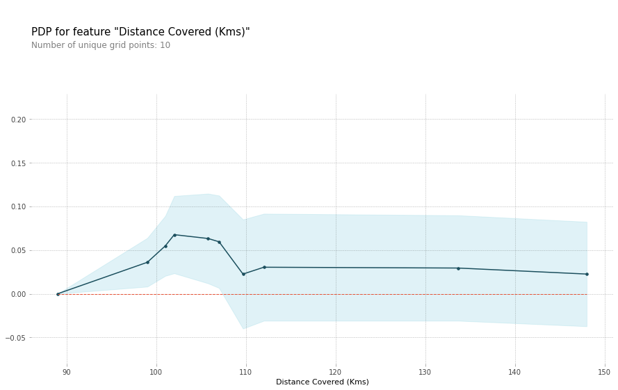
Here is the code to create the Partial Dependence Plot using the PDPBox library.
from matplotlib import pyplot as plt
from pdpbox import pdp, get_dataset, info_plots

# Build Random Forest model
rf_model = RandomForestClassifier(random_state=0).fit(train_X, train_y)

# Create the data that we will plot
pdp_dist = pdp.pdp_isolate(model=rf_model, dataset=val_X, model_features=feature_names, feature=feature_to_plot)

# plot it
pdp.pdp_plot(pdp_dist, feature_to_plot)
plt.show()
SHAP Values
SHAP Values (an acronym from SHapley Additive exPlanations) break down a prediction to show the impact of each feature. Where could you use this?
- A model says a bank shouldn't loan someone money, and the bank is legally required to explain the basis for each loan rejection
- A healthcare provider wants to identify what factors are driving each patient's risk of some disease so they can directly address those risk factors with targeted health interventions
How They Work: SHAP values interpret the impact of having a certain value for a given feature in comparison to the prediction we'd make if that feature took some baseline value.
We could ask:
- How much was a prediction driven by the fact that the team scored 3 goals?
- How much was a prediction driven by the fact that the team scored 3 goals, instead of some baseline number of goals.
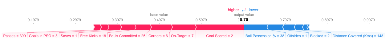
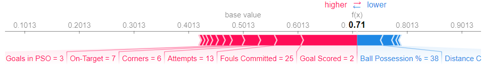
How do you interpret this? We predicted 0.7, whereas the base_value is 0.4979. Feature values causing increased predictions are in pink, and their visual size shows the magnitude of the feature's effect. Feature values decreasing the prediction are in blue. The biggest impact comes from Goal Scored being 2. Though the ball possession value has a meaningful effect decreasing the prediction. If you subtract the length of the blue bars from the length of the pink bars, it equals the distance from the base value to the output. There is some complexity to the technique, to ensure that the baseline plus the sum of individual effects adds up to the prediction (which isn't as straightforward as it sounds).
Code to Calculate SHAP Values: We calculate SHAP values using the wonderful Shap library.
import shap  # package used to calculate Shap values

# Create object that can calculate shap values
explainer = shap.TreeExplainer(my_model)

# Calculate Shap values
shap_values = explainer.shap_values(data_for_prediction)
The shap_values object above is a list with two arrays. The first array is the SHAP values for a negative outcome (don't win the award), and the second array is the list of SHAP values for the positive outcome (wins the award). We typically think about predictions in terms of the prediction of a positive outcome, so we'll pull out SHAP values for positive outcomes (pulling out shap_values[1]). It's cumbersome to review raw arrays, but the shap package has a nice way to visualize the results.
shap.initjs()
shap.force_plot(explainer.expected_value[1], shap_values[1], data_for_prediction)
Summary Plots
Permutation importance is great because it created simple numeric measures to see which features mattered to a model. This helped us make comparisons between features easily, and you can present the resulting graphs to non-technical audiences. But it doesn't tell you how each features matter. If a feature has medium permutation importance, that could mean it has
- a large effect for a few predictions, but no effect in general, or
- a medium effect for all predictions.
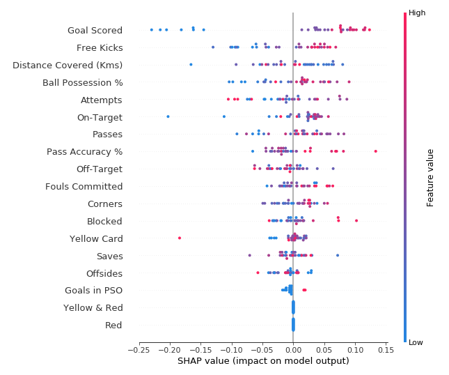
This plot is made of many dots. Each dot has three characteristics:
- Vertical location shows what feature it is depicting
- Color shows whether that feature was high or low for that row of the dataset
- Horizontal location shows whether the effect of that value caused a higher or lower prediction.
Some things you should be able to easily pick out:
- The model ignored the Red and Yellow & Red features.
- Usually Yellow Card doesn't affect the prediction, but there is an extreme case where a high value caused a much lower prediction.
- High values of Goal scored caused higher predictions, and low values caused low predictions
Summary Plots in Code:
import shap  # package used to calculate Shap values

# Create object that can calculate shap values
explainer = shap.TreeExplainer(my_model)

# calculate shap values. This is what we will plot.
# Calculate shap_values for all of val_X rather than a single row, to have more data for plot.
shap_values = explainer.shap_values(val_X)

# Make plot. Index of [1] is explained in text below.
shap.summary_plot(shap_values[1], val_X)
Data and Info Source by Kaggle Machine Learning Explainability.